Introduction
Over the past few weeks, I’ve been working on revamping my portfolio site. About time, too, as for the past several years I’d been using a React/ThreeJS portfolio that I built following a tutorial.
These days, I understand a whole lot more about all the things I didn’t know I didn’t know - especially when it comes to web development. My first task as a renewed Websmith was to rebuild my namesake site from the ground up.
I’ll be writing up my progress as I go along, potentially turning this into a series if I rescope or add features down the line. My goal is to demonstrate the thought processes, struggles, and feelings that go into a full-stack project like this.
The Planning Phase
I had no idea what I wanted my portfolio to look like. Most of the web portfolios I’ve seen have been pretty cut and dry. Simple, static sites with a few pages of information and content. I spent a lot of time looking at various portfolio sites, and ultimately I decided I wanted something more representative of my personality. Thus, I went in with some requirements:
- Made in NextJS and Tailwind
- Full mobile compatibility
- Interactive
- Animated
- Fun and interesting
Why NextJS?
For a long time, the concepts of server vs client rendering seemed beyond my ken. As I grew to learn more about the JavaScript ecosystem and how front-end framework tools actually work, I finally grew to understand how nice it is to have tools like Vite and NextJS.
Prior to this portfolio, I mainly stuck to Vite and React for my web projects. But with NextJS’s promise of easy Search Engine Optimization and performance potential, I wanted to give it a try. Plus, Vercel’s hosting is a really easy way to share the progress of my website with others for feedback.
First Iteration
While I was searching for inspiration and doing deep-dives on trending design philosophies, I found a great Medium article on neobrutalism by Sepideh Yazdi. And so, my initial pass at a portfolio design was a fun exploration of a new-yet-retro aesthetic style.
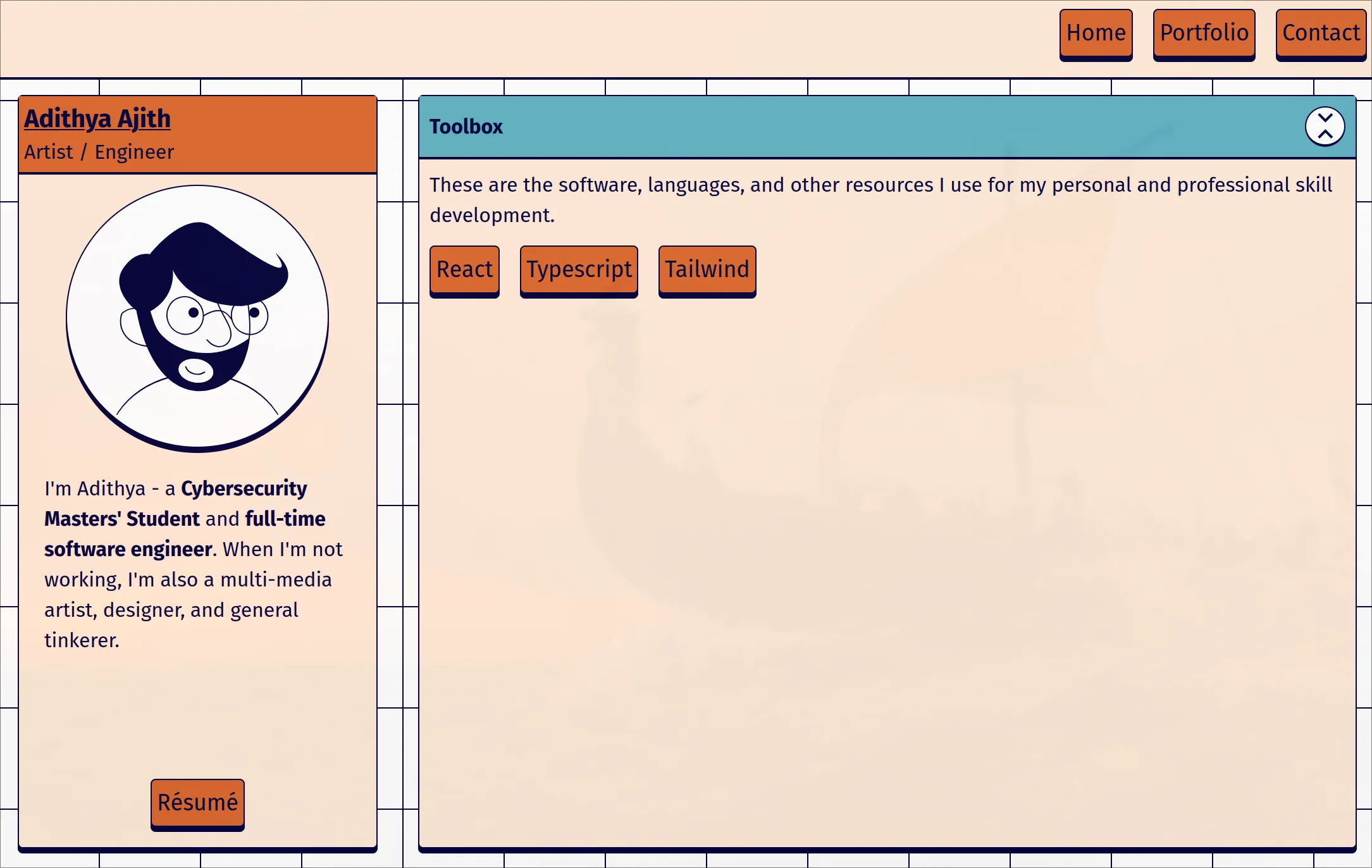
I got mixed reviews from this design, with some appreciating the bright colors and thick borders whereas others found it a little too childish and gimmicky for a professional portfolio site. Ultimately, I ended up scrapping the idea to build something a little more modern. Or should I say something a little less retro?
Riffing on Operating Systems
With my recent explorations of Linux, I’ve been learning increasingly more about the lower levels of computing. I’ve always been fascinated by operating systems and I have a personal goal to eventually build one from scratch. Drawing inspiration from that desire, I decided to experiment with my knowledge of web technologies to try and simulate the user experience of an operating system while still being functional as a personal portfolio.
I used the neobrutalist style as a starting point for my website (although clearly I didn’t stick with it). With a general design language in mind, I set to work actually building out the interface in React. Since the aim was to replicate an operating system, I started in what seemed to a sensible place: the taskbar.
Taskbar
A taskbar is the central hub of an operating system’s UI. It’s what provides the user with the tools they need to access all of the other features of the OS. A portfolio website doesn’t exactly have a lot of features, so for my purposes the taskbar would be mostly eye-candy. But don’t underestimate the importance of visual cohesion!
Initially, I started with a top taskbar. I’m used to a top bar layout on my Linux config, and it felt like the top bar would be more analogous to a navigation bar on a traditional website. The only things I needed the taskbar to accomplish really were to serve as an introduction to the portfolio, and to show which “applications” were currently open.
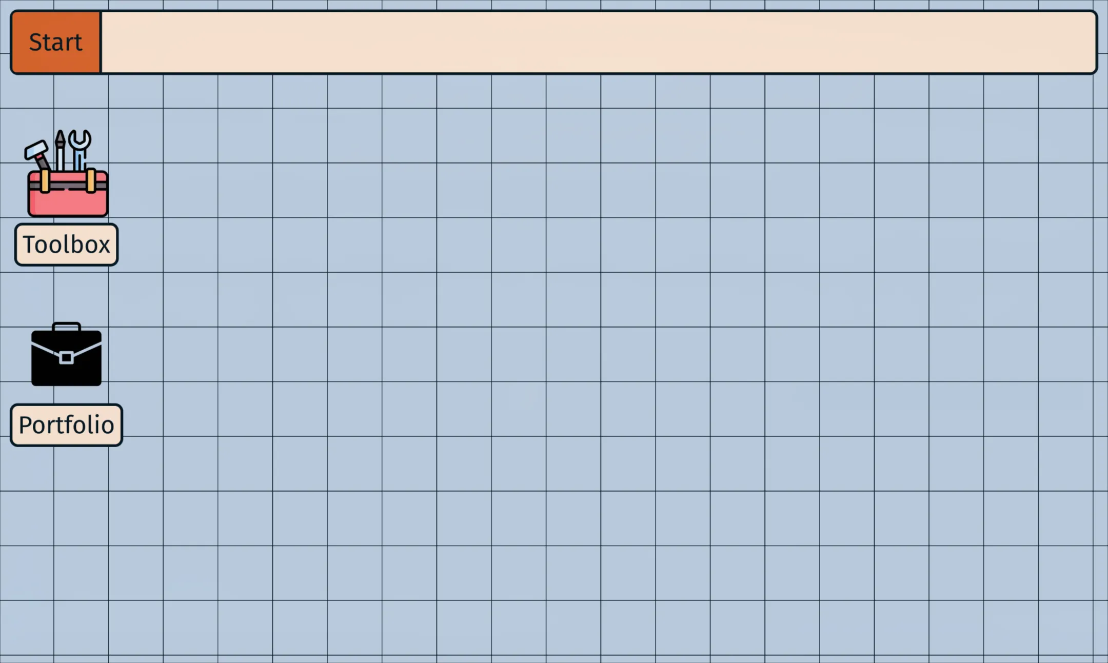
Applications
In this version, I also added an application system. Basically, the application icons are buttons that launch a “window.” I accomplished this in React with a stateful component that keeps track of all currently open applications in an array. When the array changes - i.e. an application is opened, closed, or otherwise changed in some way - the component is re-rendered, and so are all of the application components. There may exist some optimization potential here if React doesn’t cache the component objects themselves to prevent re-rendering of applications that haven’t changed beyond their positioning in the array, and I will potentially look into that later.
I made the applications themselves draggable and animated the app in general using GSAP - a pretty robust web animation system. Their documentation is really solid and everything I needed to know about integrating GSAP in a React application was boiled down to a single hook: useGSAP().
As I was developing this application system, I quickly grew tired of drilling props back and forth between various layers of the website. This seemed like the perfect use case for React’s Context API. I used the docs to whip up an Application Context component, and suddenly any component that needed access to the current application information simply needed to be wrapped with a Provider.
This made it easy to extend the functionality and interactivity of the application system to other parts of the website like the taskbar. Rather than the array of apps needing to be passed up from the WindowManager component and back down into the Taskbar component, the Taskbar component could instead get the current Application Context item and subscribe to or publish changes directly the active list of applications (i.e. the Taskbar could now list which apps were open and toggle focus when those list items were clicked).
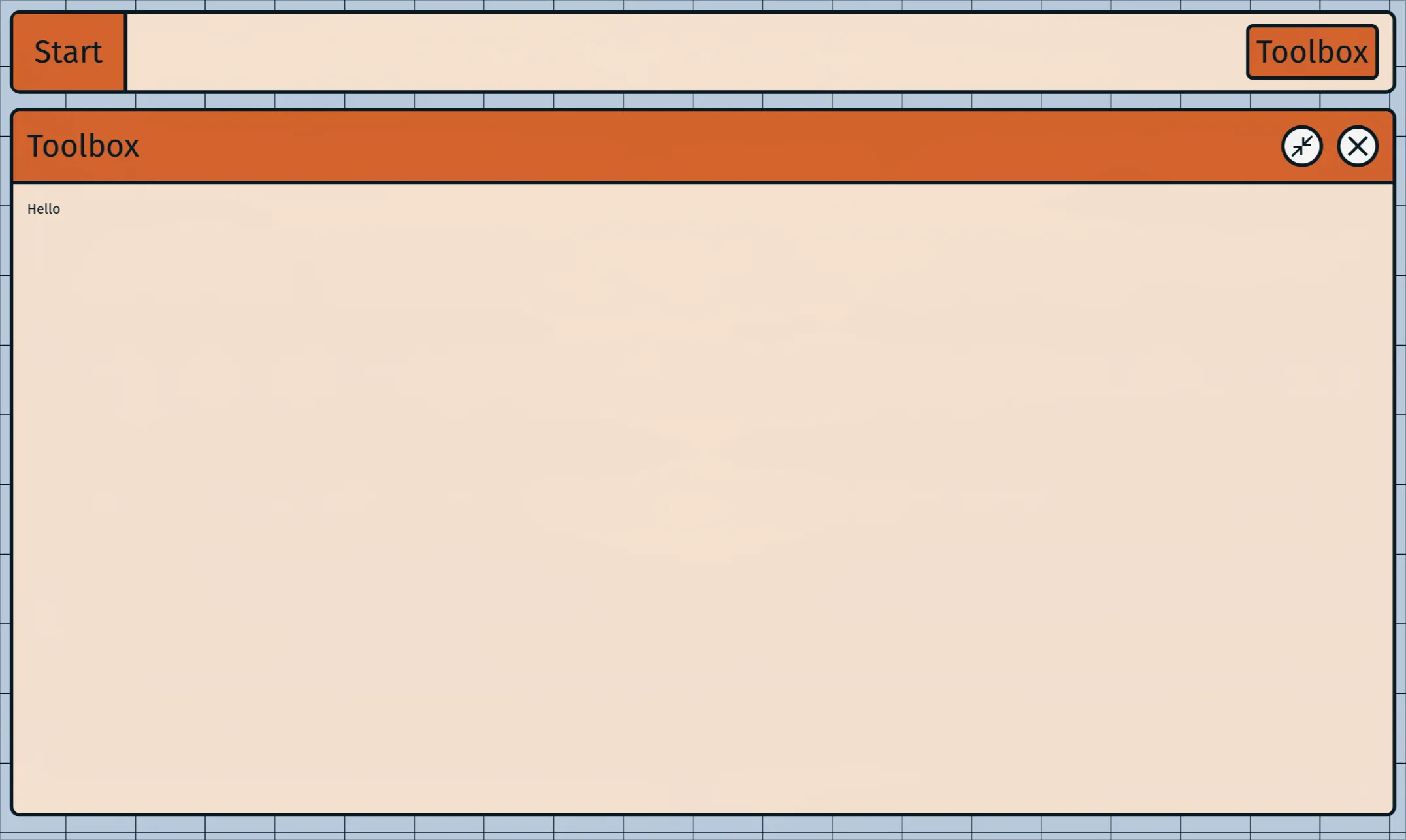
In earlier renditions of adiOS, I also had added the ability to maximize application windows. This was just a quick CSS toggle from auto width/height to 100%. I ended up scrapping this as it made the applications feel less consistent when resizing and changing their layouts. The application sizes are instead manual until they exceed the viewport dimensions.
Redesigning Everything
Great, so everything’s coming together! The application mimics the general feel of an operating system with pages represented by interactive app icons and a working taskbar. There was just one problem: I kind of hated the way it looked. Time for a makeover.
So, neobrutalism didn’t work out. What next? When I was making my cousin’s website, I briefly experimented with an Applèsque glassmorphism effect. The blurs, transparencies, and super round corners definitely have their appeal and I think Apple in general tends to knock it out of the park with their design choices. Their old skeumorphic designs are still some of my favorites.
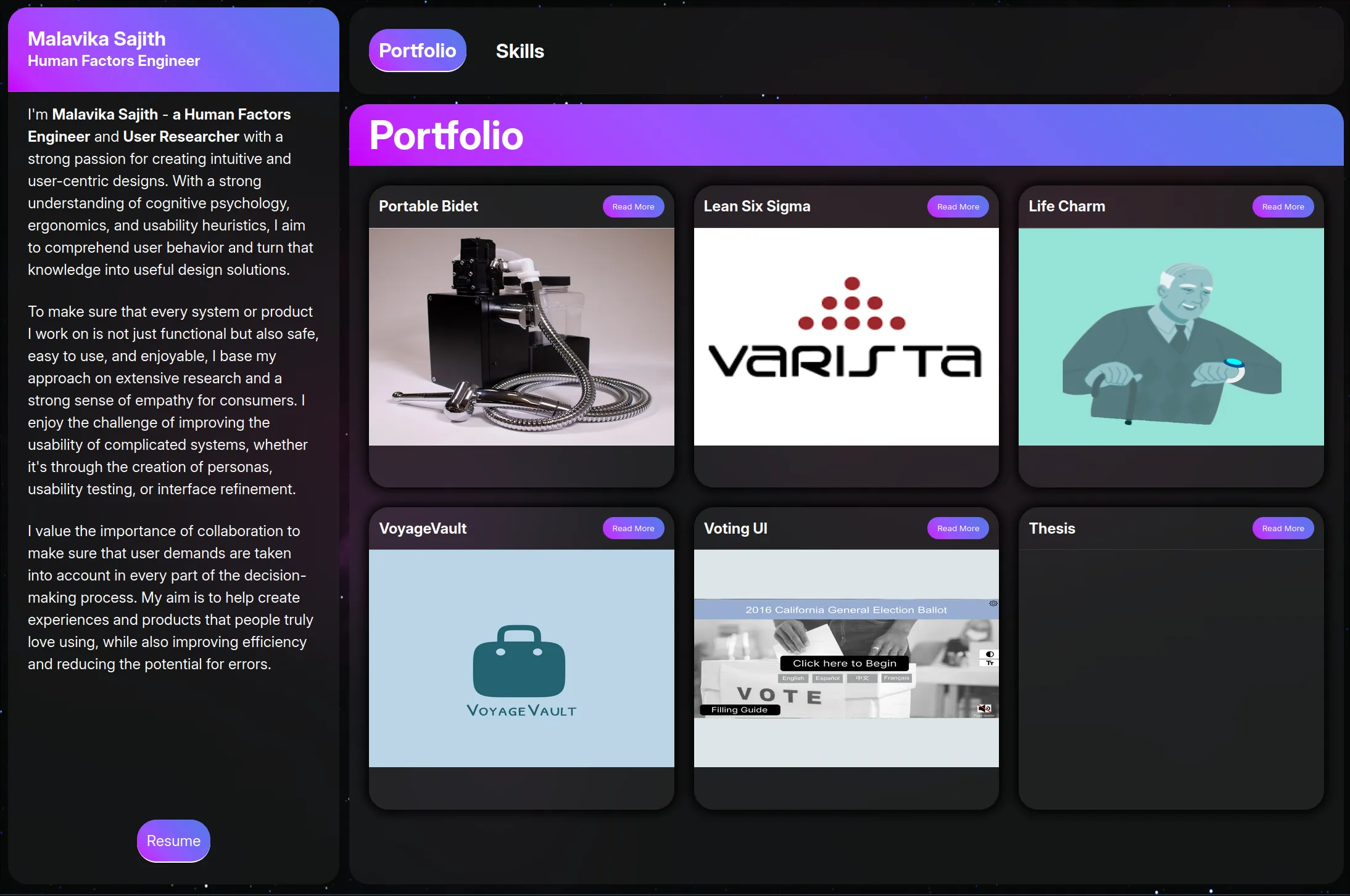
However, I’m trying not to be too derivative here. I want to mix things up somehow. As someone who was practically raised by the Internet, I have a lot of nostalgia for the Y2K aesthetic. It’s cropped back up in a ton of different ways recently (e.g. vaporware, outrun, etc.) and I wanted to try and evoke that mid-2000s feeling of a wilder, freer Internet ecosystem.
Thus, I knew I had to do an homage to the operating system that defined my childhood: Windows XP. So many hours spent playing Minesweeper and Solitaire and 3D Pinball and listening to David Byrne’s “Like Humans Do” tend to leave a lasting impression on a growing boy. Maybe it was because I was so young, but everything about XP felt like the de facto standard for computers and operating systems. Then again, Microsoft was literally monopolizing the market at the time, so maybe it’s not that surprising.
At any rate, I got to work borrowing influences from XP. The first step was color. XP’s color palette is vibrant and comfortable. Some have criticized XP as a whole for being childlike and unprofessional, but I guess XP and I have that in common when it comes to design tastes. I started by mixing XP’s color palette with some elements of glassmorphism (mainly the transparency and the blur effects). I also used a modern image of the Bucolic Green Hills and blurred it using CSS for the background.
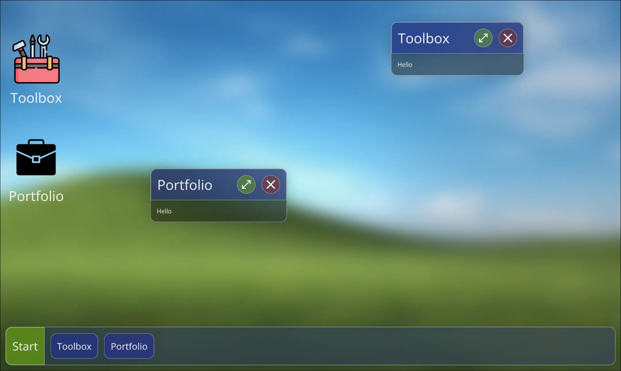
Honestly, I really liked this design. There were just a couple things that kept me from committing to it entirely:
- The blur and transparency were really finicky on Apple devices. I don’t know if it’s got something to do with Apple’s latest suite of OS upgrades, but not a single browser on my iPhone would load the blur filter properly. It made a lot of the UI elements completely unreadable, and none of the fixes I found online seemed to help. I still have no clue how to resolve this, and you may actually notice that the hovering effects on app icons to this day don’t blur properly on some devices.
- The whole design reads like a tablet OS. Not that there’s anything inherently wrong with that! It just didn’t evoke the feeling that I was going for of a turn-of-the-millenium computer being booted up for the first time in a long time.
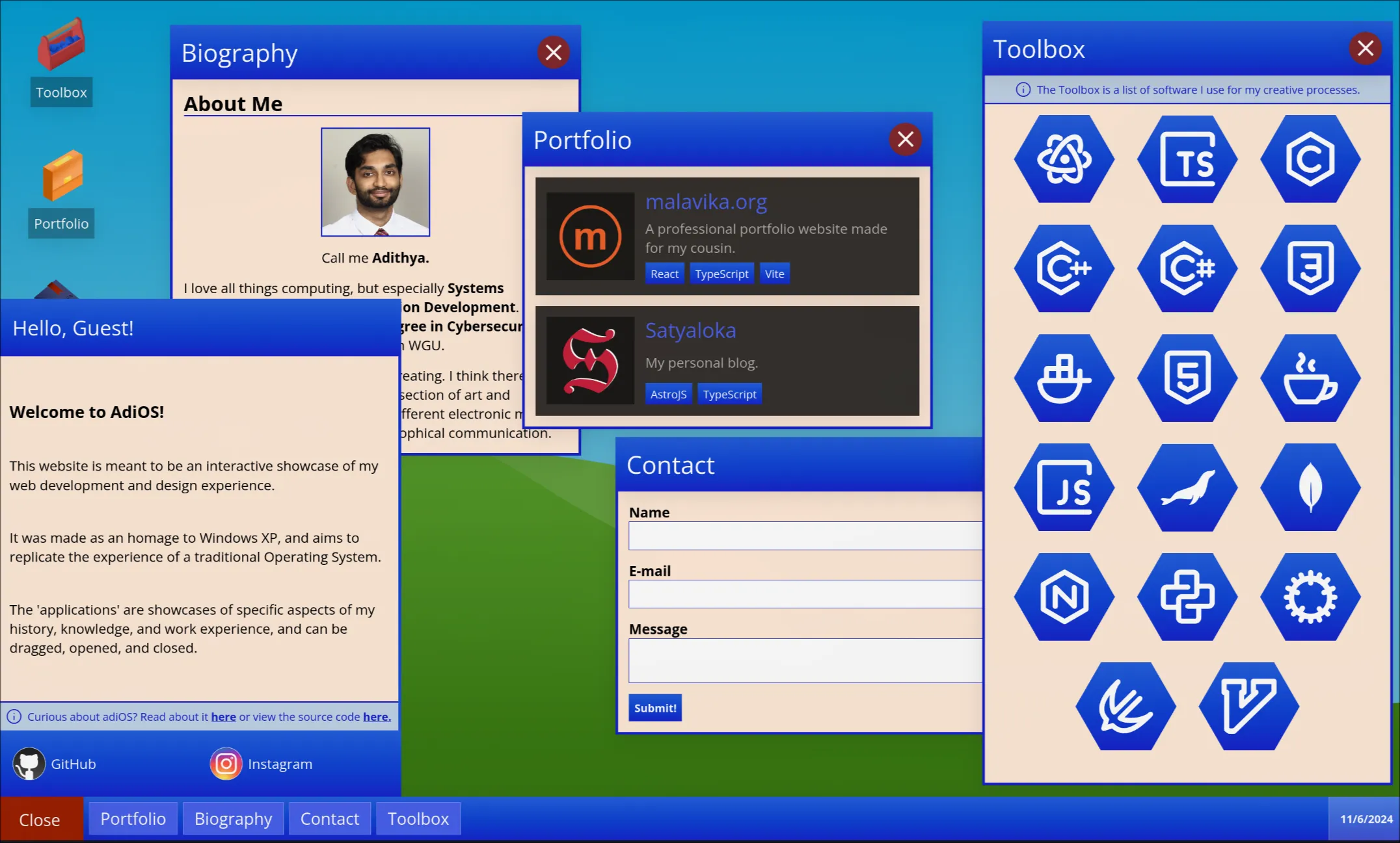
The only right move, logically, was to get rid of the glassmorphism and really lean into Windows XP. I swapped out the dark gray backgrounds for a sandy off-white. I sharpened up the corners of all the divs. I made the taskbar flush with the screen’s edges. And most importantly - I put gradients on anything and everything.
I even went ahead and created some custom vector art assets in Affinity Designer for the icons and the background. It was my first time working isometrically and I’m new to vector art in general, but I think they came out rather nice.
![]()
Now it’s time to add actual content to the applications.
Adding Content
Finally, everything is starting to look right. I’m pretty satisfied with the general artistic direction of the site, so it’s about time to populate the various applications and screens with data. The apps I’ve laid out are Toolbox, Portfolio, Biography, and Contact. I think these cover the majority of my skills and background, but undoubtedly I’ll add more as my knowledge and experience grow.
The Toolbox is meant to show off the technology that I’m comfortable or getting comfortable working with. I don’t always have access to source code or old projects, so noting down which software I’m actually familiar with seems like a good way to get my capabilities across.
The Portfolio is for other projects that I’ve worked on and am particularly proud of. These are pieces that represent me as both an artist and an engineer, and should reflect my current levels of expertise.
The Biography is a short rundown of who I am as a person. My background and history as well as my goals and values.
Finally, the Contact application is just meant to serve as a way to send me a message. I’m not sure how many people actually interact with these portfolio forms, so this entire application is actually just for show (don’t tell anyone).
Conclusion
All in all, this has been a pretty awesome project to work on. I feel like the end result is a solid representation of both my skills and interests. It taught me a lot about design trends and adapting styles to fit my personal vision. The final product feels smooth and responsive (in my opinion) and most everyone that I’ve shown returned with positive feedback. It forced me to try out a new frontend framework and to deal with the pain of reading new documentation.
This has been one of the first projects I’ve worked on solely for myself, but it sure won’t be the last. I love programming and design and I especially love exploring my creativity through technology. I hope that this site can capture even a modicum of the passion that I have for the art form that is web design.
If you’ve made it this far, thanks so much for your time. I hope reading through my process has helped you with your own in some way!
Extra
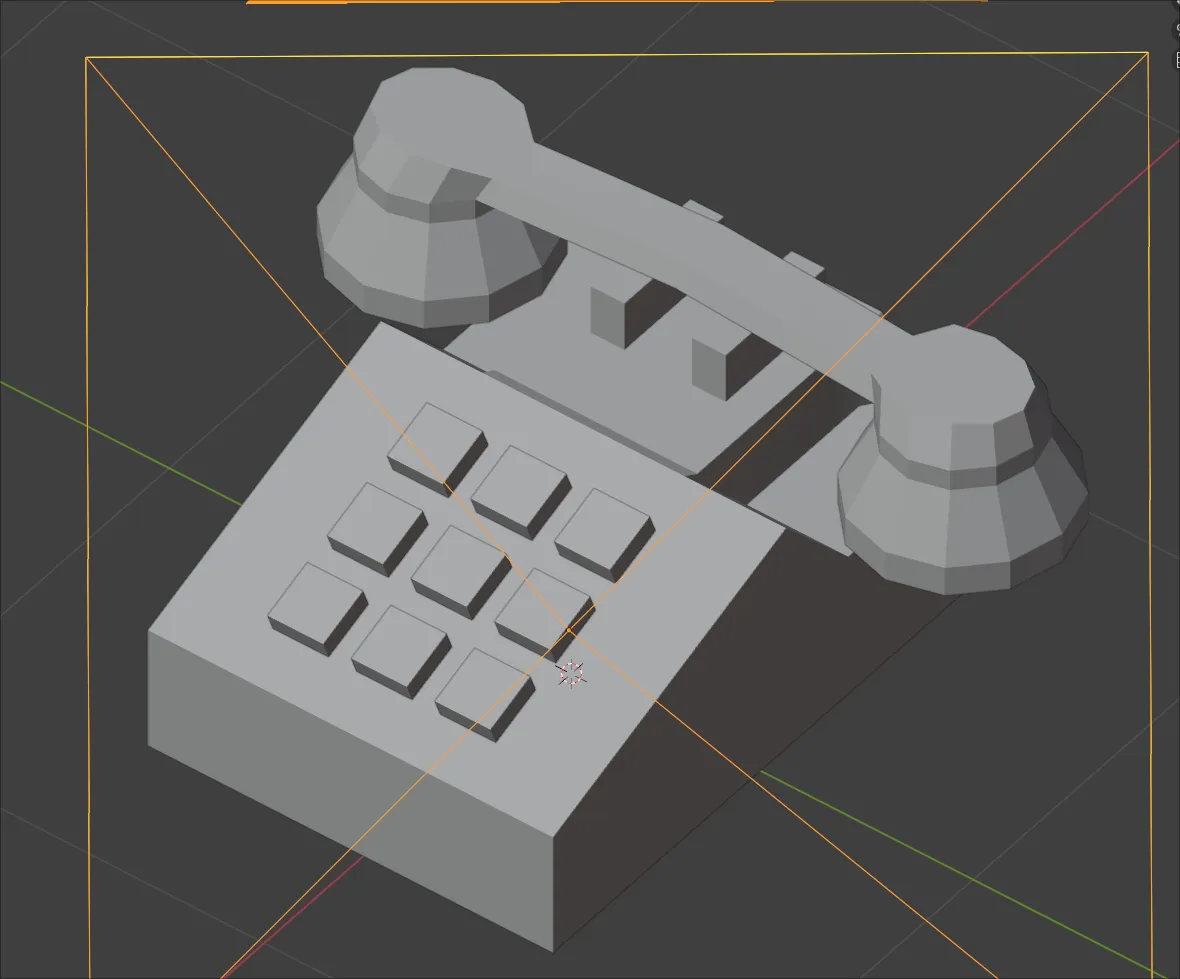
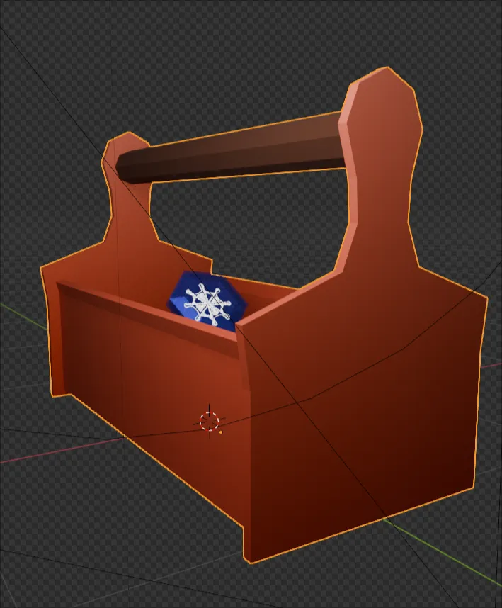
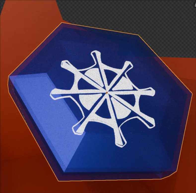
If you’ve a keen eye, you’ll see that the telephone in the Contact icon isn’t quite a vector. It was too complex a shape for me to puzzle out in two dimensions, so I hopped into Blender and whipped up a low poly telephone, added a point light, and rendered it out in orthographic view. I’ll probably go ahead and do the same with the other icons at some point (and I actually did try it with the Toolbox), but it’s lower priority at the moment.
